Creating Cool UI: Reusable Animated Gradient Text for UIKit
How the KHGradientTextView component uses glyph-shaped clipping, saved graphics state and a moving gradient become a reusable UIKit text component, with illustrated steps and an attributed-string API.
UIKit makes it easy to give a phrase a different font or foreground color. Sometimes I want a little more: a gradient inside the letters, with colors that move while the surrounding paragraph stays ordinary text.
I've turned that effect into KHGradientTextView, a standalone Swift package for UIKit. Add a custom attribute to a range, and the view handles its gradient fill and animation. The text still goes through UIKit's normal layout system.
The underlying idea is a stencil: use the letter shapes to control where paint can land, draw a gradient through those shapes, then restore the drawing state before continuing with the next text run. This builds on Animating Gradient-Filled Text in UIKit, which develops the renderer from scratch. Here is how that idea fits into a reusable component.
Paint through a stencil
Imagine placing a sheet with letter-shaped holes over a canvas. Brush a broad stripe of color across it. The paint reaches the canvas only through the holes. Lift the sheet, and the letters remain filled with that color.
A Core Graphics clipping region does the same job. It restricts which pixels subsequent drawing operations can affect. The glyph outlines supply the letter shapes, including the empty counters inside letters such as “o”. The gradient can cover a whole rectangle; only its intersection with the glyph-shaped clip becomes visible.
Lay out ordinary text
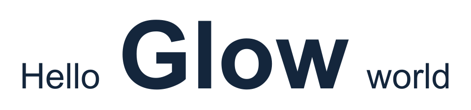
TextKit lays out the whole sentence first. Here, “Glow” has a larger, bold font, but it still shares the line with ordinary text.
Make the glyph-shaped stencil
The blue area represents the part of the canvas we cannot paint. The checkerboard marks the letter-shaped openings. Notice that the center of “o” stays blocked.

Paint through the openings
Draw a gradient across the stencil. Only the letter shapes receive color; the blue area stays protected.
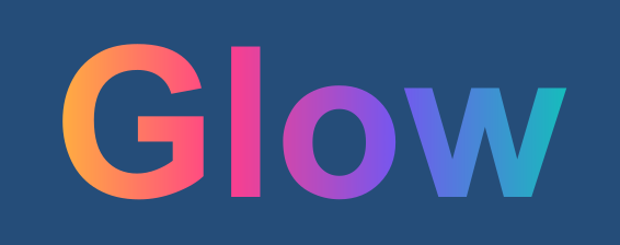
The stencil in this illustration represents a temporary drawing restriction. The component creates it directly in the graphics context using text clipping. It does not need a separate bitmap mask or a gradient layer for every word.
There are two independent jobs here. TextKit decides the shapes and positions of the glyphs. Core Graphics decides how those shapes are filled. Changing the fill therefore leaves the line breaks, baselines and positions alone.
Save, clip, paint, restore
TextKit calls the layout manager's showCGGlyphs method with a glyph run: the glyph IDs, their positions, the font and the attributed-string attributes. Ordinary runs go straight to the superclass. A run carrying .khTextGradient takes a temporary clipping-and-painting path.
Inside that override, the essential sequence is:
context.saveGState()
defer { context.restoreGState() }

context.setTextDrawingMode(.clip)
super.showCGGlyphs(
	glyphs,
	positions: positions,
	count: glyphCount,
	font: font,
	textMatrix: textMatrix,
	attributes: attributes,
	in: context
)

context.drawLinearGradient(
	gradient,
	start: start,
	end: end,
	options: [.drawsBeforeStartLocation, .drawsAfterEndLocation]
)
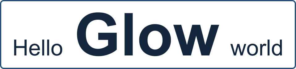
First, saveGState() preserves the caller's drawing state. That includes the current clipping region and text drawing mode. The context may already have a clip imposed by UIKit, such as the area being redrawn. The blue outline below represents that original clipping region.
Next, .clip changes what drawing the glyphs means. The call to super.showCGGlyphs contributes the actual glyph shapes to the clipping region instead of painting ordinary foreground-colored letters. The new clip is the intersection of the previous clip and those shapes.
Then drawLinearGradient paints through that restricted region. It does not need to know the outline of every letter: clipping has already established which pixels it may affect.
Finally, the defer restores the saved state when the override returns. Restoring state keeps the gradient pixels that were just drawn. It restores the drawing rules, including the original clipping region and text drawing mode, so the following run can render normally.
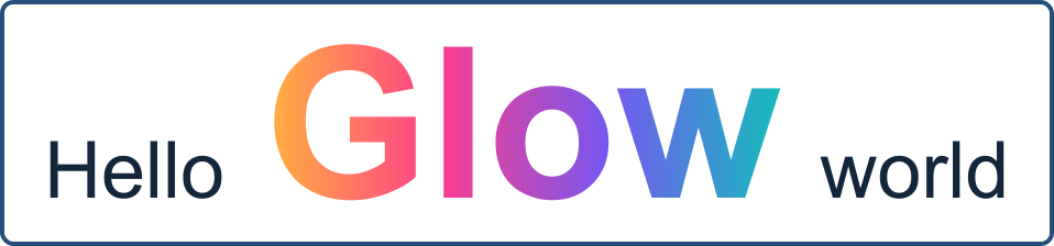
This pairing matters. If the glyph clip leaked into later drawing, the next word would still be restricted to the previous word's letter shapes. Its pixels could disappear. Clipping also only narrows the existing region; making a larger rectangle does not undo an earlier clip. Restoring a saved state is how we get the caller's region back. Apple's documentation describes both the saved graphics state and clip intersection.
The complete renderer also saves and restores an inner state for each line fragment. Its nesting is:
Save the caller's graphics state
    Add the current glyph run to the clip
    For each relevant line fragment:
        Save the glyph-clipped state
        Intersect it with this fragment's rectangle
        Paint this fragment's gradient
        Restore the glyph-clipped state
    Restore the caller's graphics state
Continue drawing the next text run
The inner restore prevents one line's rectangle from constraining the next line. The outer restore prevents the current glyph run from constraining subsequent runs.
Keep the stencil still and move the colors
Animation changes the gradient's start and end points. Each redraw uses the same laid-out glyph positions to recreate the clip, then paints the gradient at a different phase. The letters stay where TextKit put them.
Horizontal motion
Move the fill along the x axis. In this illustration, the colors travel to the right while the glyph-shaped opening stays fixed.

Vertical motion
Move the fill along the y axis instead. Here, the colors travel downward through the same stationary letters.
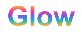
These are vector illustrations of the drawing model, each with a one-second loop. They pause when the browser requests reduced motion. The UIKit recording below shows the component itself.
The palette repeats and closes back onto its first color. Moving by exactly one palette period gives the same appearance at the beginning and end of a cycle. This is what makes the loop continuous for three or more colors as well as two.
Horizontal motion changes the x coordinates of the gradient endpoints; vertical motion changes their y coordinates. Reversing the phase reverses the travel direction. A CADisplayLink advances this phase using elapsed time and invalidates text display. It does not need to rebuild the attributed string or force a new text layout for each animation frame.
See the real component running
The recording below is captured from the UIKit demo. It shows downward and upward fills, horizontal fills, bold and underlined text, independent ranges, and a paragraph mixing gradient and ordinary text. The example cycles range from 0.4 to 1 second.
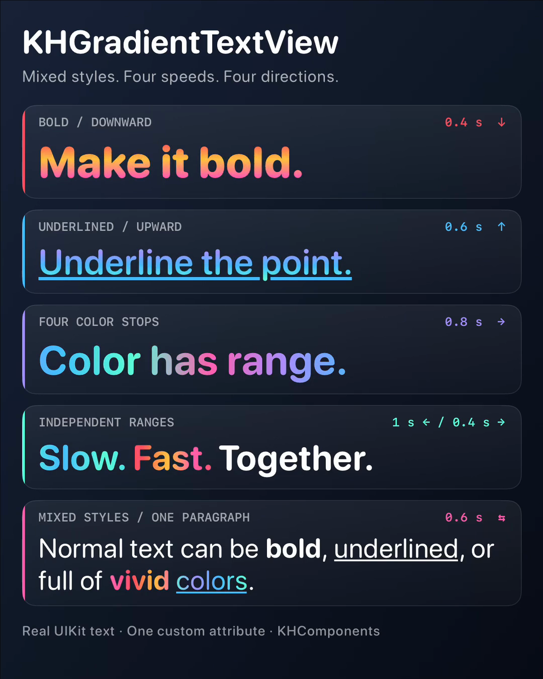
Play the twelve-second recording, or download the MP4.
The diagrams explain the drawing model; this recording shows its actual rendering and timing.
Add one attribute
The public API has three pieces:
KHGradientTextView, aUITextViewsubclass with a custom TextKit 1 layout manager.KHTextGradient, an immutable value containing the palette, duration and animation direction.NSAttributedString.Key.khTextGradient, the attribute that attaches that value to a range.
For example, this highlights three words inside a sentence:
import UIKit
import KHGradientTextView

let text: NSMutableAttributedString = .init(
	string: "Watch vivid flowing colors move.",
	attributes: [
		.font: UIFont.preferredFont(forTextStyle: .body),
		.foregroundColor: UIColor.label
	]
)

let gradient: KHTextGradient = .init(
	colors: [.systemPink, .systemIndigo, .systemTeal],
	duration: 0.8,
	animationDirection: .leftToRight
)

text.addAttribute(
	.khTextGradient,
	value: gradient,
	range: (text.string as NSString).range(of: "vivid flowing colors")
)

let textView: KHGradientTextView = .init()
textView.adjustsFontForContentSizeCategory = true
textView.attributedText = text
The attribute carries rendering metadata. A normal UILabel does not understand the custom key; it uses the fallback .foregroundColor. KHGradientTextView understands the key and uses it to choose the clipping-and-gradient path for the affected glyph runs.
The range uses NSString because attributed-string ranges use UTF-16 offsets. Keep the ordinary .font and .foregroundColor attributes: the font controls layout, and the color supplies a fallback for other renderers. The immutable gradient value can be shared between ranges.
Add the view to your hierarchy and lay it out as another text view. UIKit still owns measurement and line breaking, so sizeThatFits(_:) responds to the available width. The component defaults to a clear background, zero text insets, and disabled editing and scrolling, making it convenient for short passages and label-like content.
Static gradients, directions and speeds
animationDirection selects both the gradient axis and its travel direction:
.leftToRightand.rightToLeftuse a horizontal gradient..topToBottomand.bottomToTopuse a vertical gradient.
Static fills use the same axis. Their palette runs left to right or top to bottom; choosing the opposite travel direction changes animated motion, not the static palette order.
let verticalStaticFill: KHTextGradient = .init(
	colors: [.systemOrange, .systemPink],
	isAnimated: false,
	animationDirection: .topToBottom
)

let upwardFill: KHTextGradient = .init(
	colors: [.systemIndigo, .systemTeal, .systemPink],
	duration: 0.6,
	animationDirection: .bottomToTop
)
Each animated range can have its own duration and direction. The library defaults to animation enabled, a two-second cycle, and right-to-left motion. The faster values in the showcase are example settings.
The view also exposes isAnimationEnabled; setting it to false freezes the phase and releases its display link. hasAnimatedText reports whether the content requests a valid animation; isAnimating reports whether the display link is running.
An empty palette uses the ordinary foreground color. A single color gives a solid fill. Identical colors do not animate, and a nonpositive or nonfinite duration produces a static fill.
Wrapping and mixed typography
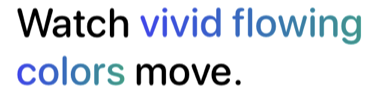
A highlighted phrase across two lines
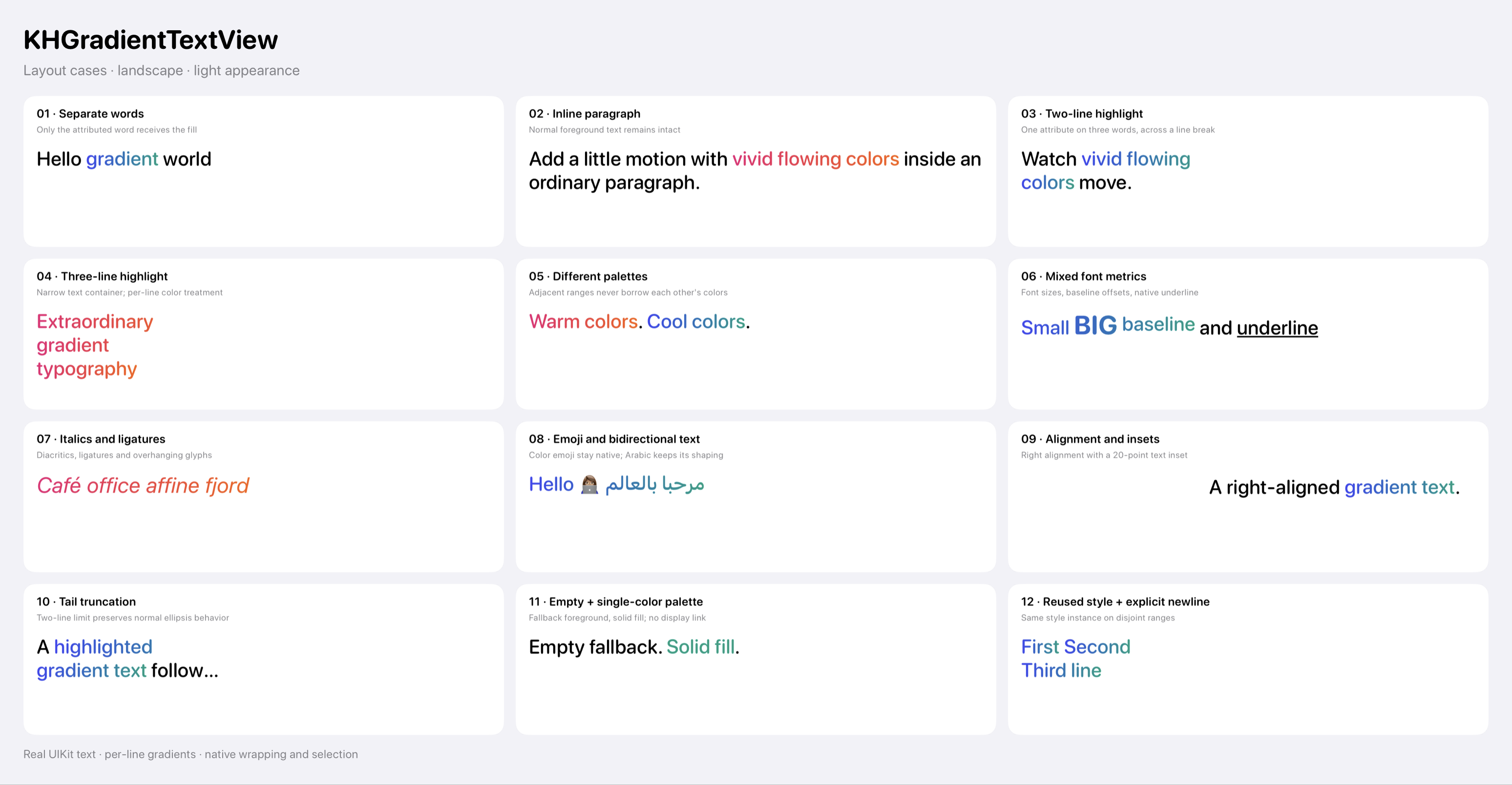
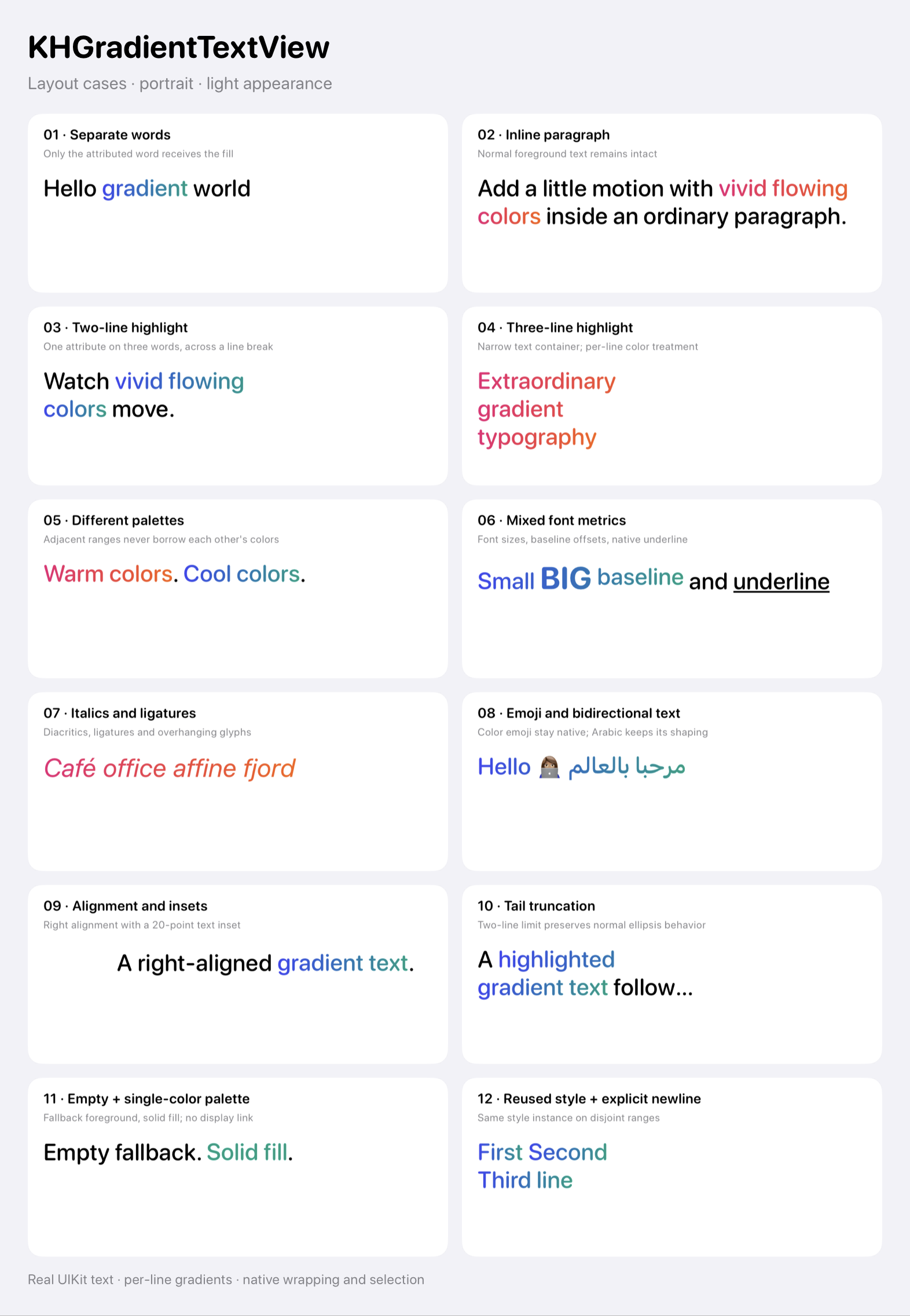
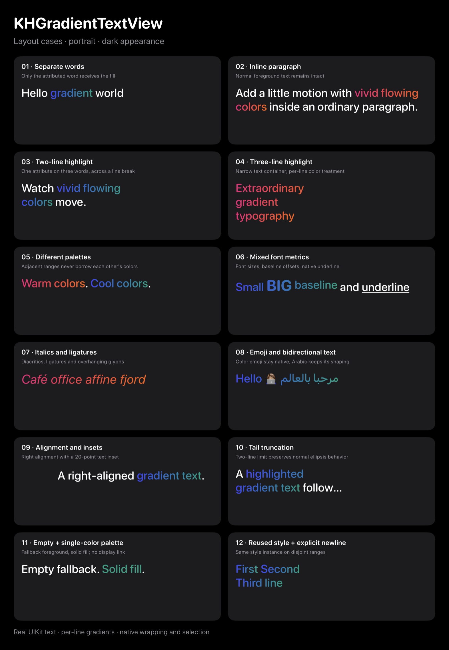
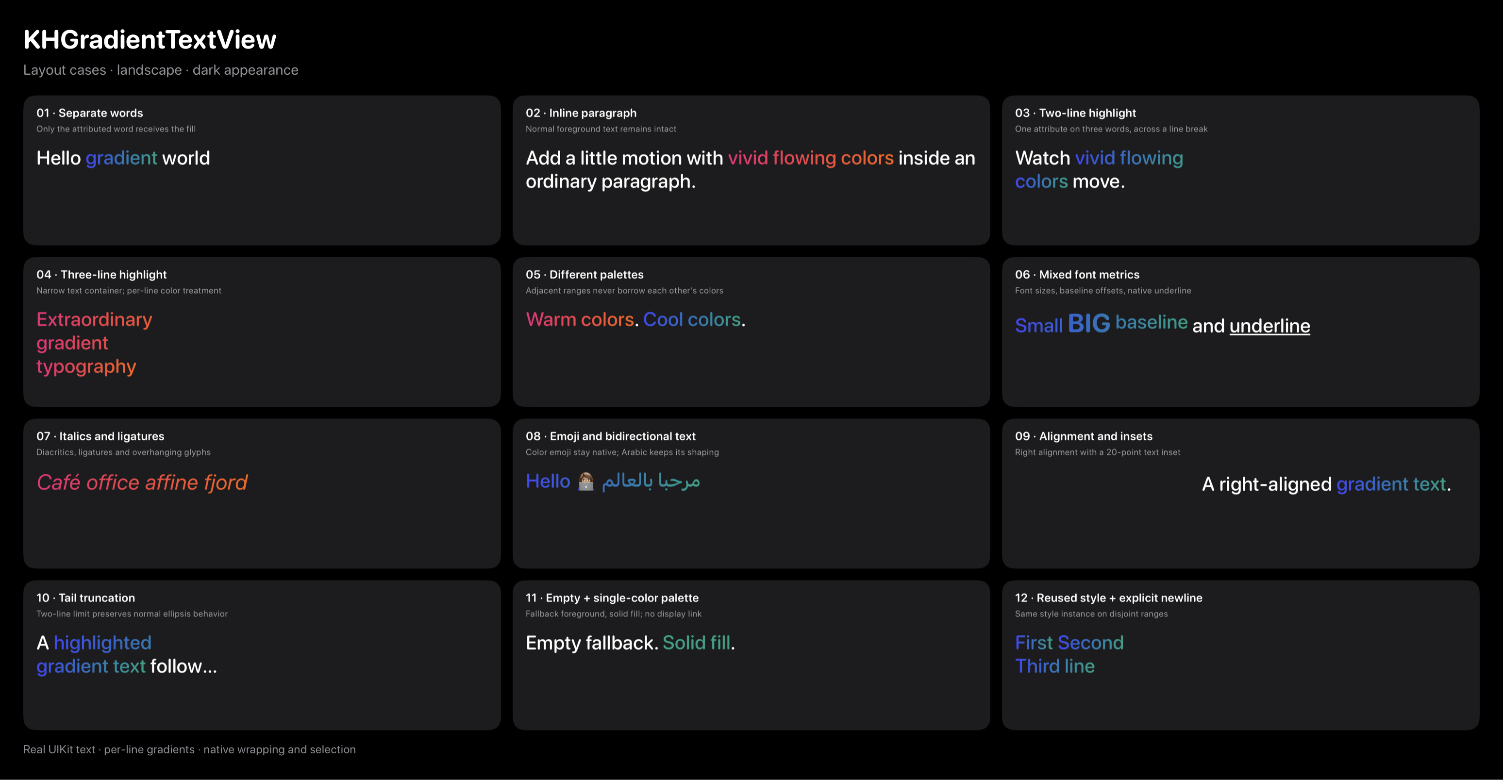
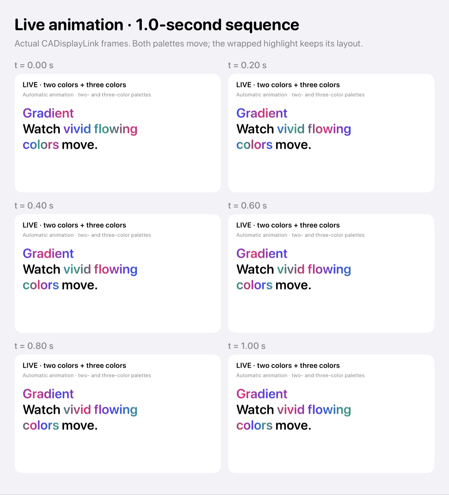
The gradient attribute covers “vivid flowing colors”, while “Watch” and “move.” keep their ordinary foreground color. When the phrase wraps, each line fragment gets its own gradient. This close-up is cropped directly from the UIKit demo capture.
The same range across three lines
A narrower text container wraps “Extraordinary gradient typography” onto three lines. It is still one attributed range; TextKit supplies the line breaks and the renderer paints each fragment.
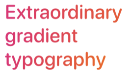
A vertical gradient also runs down the letters on each line, rather than stretching from the top of the first line to the bottom of the whole paragraph.
Mixed fonts, baselines and underlines
The gradient continues across “Small BIG baseline”, including a larger bold word and a raised baseline. “and underline” uses ordinary black text, with a standard UIKit underline under the final word.

The geometry comes from the complete effective gradient range on each line, even when TextKit requests only a partial redraw or changes fonts within the phrase. That keeps the color positions stable across mixed fonts and redraw boundaries. Additional fragment clipping keeps adjacent gradient ranges from painting over one another while allowing italic overhangs.
Underlines retain UIKit's usual appearance; a gradient underline would need its own drawing pass, as discussed in the earlier technique article. Color emoji keep their native rendering.
The complete galleries also cover adjacent palettes, italics and ligatures, Arabic text, emoji, text insets and truncation: light landscape, light portrait, dark portrait, and dark landscape.
A display link only when needed
A static gradient does not need a timer. The view examines its text storage after edits and creates a CADisplayLink only when an animated gradient covers a non-whitespace range and the environment allows animation.
It releases the link when animated attributes disappear, animation is disabled, the view leaves its window, the view itself is hidden or fully transparent, the app becomes inactive, or Reduce Motion is enabled. A weak display-link proxy avoids a retain cycle. Dynamic colors are resolved for the text view's traits and refreshed after color-appearance changes.
Callers do not have to manage that timer. A screen with additional visibility rules, such as an off-screen page or scrolling viewport, can apply its own pause policy through isAnimationEnabled.
Checking the result
The component tests compare measurement against UIKit and exercise wrapped ranges, mixed fonts and Unicode, shared attributes, fallback palettes, appearance changes, partial redraws, independent speeds and directions, loop boundaries, color emoji and display-link lifetime.
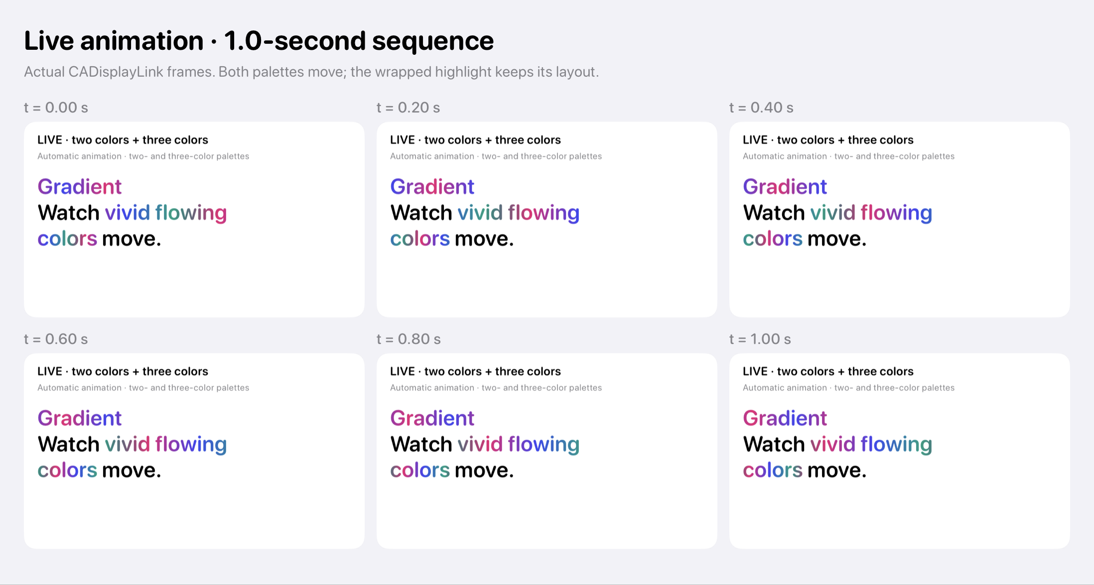
The demo also has live UI checks in portrait and landscape. The portrait and landscape contact sheets show six live samples over one second, at approximately 0.2-second intervals. That is the sample window, independent of any range's animation duration.
The component supports iOS 16 and Mac Catalyst 16 onward. It is aimed at short passages and highlights; animation invalidates the view's text for display, so a large animated document deserves its own performance investigation.
The public repository includes the complete renderer, tests and a SwiftUI preview. It has no external package dependencies and is available under the MIT or Apache 2.0 licence. For the step-by-step TextKit setup and drawing overrides, continue with Animating Gradient-Filled Text in UIKit.